> ## Documentation Index
> Fetch the complete documentation index at: https://docs.genlook.app/docs/llms.txt
> Use this file to discover all available pages before exploring further.
# Custom Button
> Design your own try-on button in Liquid while keeping Genlook's pre-built try-on modal, using the Genlook JavaScript SDK.
Choose this approach when you want full control over the try-on button's design and placement, but still want Genlook's pre-built widget to handle photo upload, generation, and the result screen.
You enable the lightweight app embed as usual, skip the button block, and render your own button anywhere in your theme.
### Setup
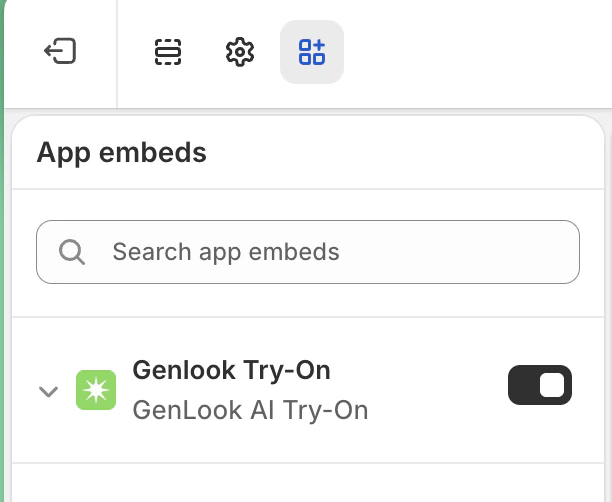
In the Shopify theme editor, open **App embeds** (bottom of the left sidebar) and toggle on **Genlook Try-On**. This loads the Genlook SDK on every page and tracks whether try-on is enabled for the current product.
Render a button with the `genlook-custom-button` class anywhere on your product pages and point its click handler at `Genlook.cabin.open()`:
```liquid theme={null}
```
That is the whole integration. Style the button however you like.
### How it works
Two conventions make this safe to drop into a global product template:
1. **The `genlook-custom-button` class.** The app embed automatically hides any element with this class on products where try-on is not enabled, so you never need conditional Liquid around your button.
2. **`Genlook.cabin.open()`** launches the try-on modal. If the widget UI has not loaded yet, the SDK fetches it and opens the modal as soon as it is ready.
The SDK preloads the widget UI in the background on enabled product pages, so the first `open()` is near-instant for most shoppers. No configuration needed.
## Where the widget reads its settings
The widget's appearance and behavior come from two layers, and the per-page tag wins for any field it explicitly sets:
1. **Widget Design tab** (Genlook app > **Widget Design**). Store-wide settings: modal color, copy, grammar gender, remaining-try-ons counter. Saved to a shop metafield and delivered on every page by the app embed. Most merchants only ever need this.
2. **`genlook-cabin-config` script tag** (per page). A JSON tag you write by hand in your template to override individual fields on that page only.
The merge is per-field. A per-page `theme.color` overrides only the color; dashboard copy, gender, and everything else stay untouched. To use the dashboard value for a field, simply omit it from `genlook-cabin-config`.
### When to use which
* **No customization needed**: install the app, add the button block from the theme editor, done.
* **Brand the widget once, store-wide**: set values in the **Widget Design** tab. No code.
* **Override on one product or template**: emit `genlook-cabin-config` on that page with only the fields to override.
## `genlook-cabin-config` reference
Place a JSON script tag with this exact `id` on the page. The SDK reads it on initialization:
```html theme={null}
```
The `id="genlook-cabin-config"` attribute is required. Make sure the JSON is valid; a trailing comma is enough to make the SDK ignore the whole tag.
### Options
Visual theming for the try-on modal.
Primary accent color inside the modal (loaders, action buttons). Accepts any valid CSS color string, e.g. `"#0ea5e9"`.
Override the text shown inside the modal.
Header title. Defaults to `"Try It On"` when empty or omitted.
Header subtitle. Defaults to `"See how it looks on you"` when empty or omitted.
Instruction shown above the upload buttons, e.g. `"Please upload a full body photo"`. Empty or omitted hides it.
Show a counter inside the modal with how many try-ons the shopper has left for the current period (daily or weekly, per your Settings).
Grammatical gender for languages with gendered grammar (Hebrew, Arabic, ...). Accepted values: `"default"`, `"male"`, `"female"`.
By default the SDK preloads the widget UI in the background on enabled product pages so the first `open()` is near-instant. Set `true` to skip preloading and load the UI only when a shopper first opens the widget.
## SDK reference
### `Genlook.ready(callback)`
Registers a callback that runs once the SDK has initialized. Safe to call before the SDK script has loaded (calls are queued), so use it whenever your code might run early:
```javascript theme={null}
window.Genlook.ready(() => {
// SDK is initialized; Genlook.cabin is available
});
```
### `Genlook.cabin.open(product?)`
Opens the try-on modal. On a standard product page the current product is detected automatically:
```javascript theme={null}
window.Genlook.cabin.open();
```
Outside a product page (or to override detection), pass a product object:
```javascript theme={null}
window.Genlook.cabin.open({
id: "123456789",
title: "Classic T-Shirt",
url: "/products/classic-t-shirt",
featured_image: "https://cdn.shopify.com/...",
});
```
### `Genlook.cabin.http.fetch(path, options?)`
Authenticated `fetch` through the Shopify app proxy. The base proxy path (`/apps/proxy_genlook-x/public`) is prepended for you, so pass endpoint paths only:
```javascript theme={null}
const response = await window.Genlook.cabin.http.fetch("/check-credits");
const { allowed } = await response.json();
```
Use it for all [widget API](/docs/virtual-tryon/custom-flow) calls instead of constructing proxy URLs by hand.
## Next steps
* Want to replace the modal too, not just the button? Build a [fully custom flow](/docs/virtual-tryon/custom-flow) on the widget API.